
Rachel Yap
In a world inundated with so many products and services, it can sometimes be difficult to distinguish one brand from another. This is where a good logo comes in handy. The most basic graphic representation of a company is a logo. It can come in many forms such as a logo mark, logo type or a combination of both. Regardless of the form, a well-designed logo is often a visual shorthand or representation of a brand. It needs to convey so much.
To many, designing a logo appears to be very simple, but the process is quite the opposite. Most designers would agree that logo design is time consuming and requires different stages of development. At antics@play, while we don’t believe in imposing rules to logo design, we do place utmost emphasis on having a structured and well thought-out process to designing one.
Having a process to logo design has really worked for me in my 22 years as a brand designer. Here’s a peek into how I tackle a logo design, and why I need the amount of time I need to produce a logo. As we often hear along our office hallways, it’s always better to be right than to be quick.
Step 1: Devouring the design brief
The 1st step in a design process is receiving and understanding the design brief. This is where we understand the nature of the company and its goal for the logo. At this stage, I try to gather as much information about the client as I possibly can. It is important to learn about the company’s story and brand positioning, its personality, objectives and target audience.
In some instances, the client may have a preferred colour scheme or style they’d like incorporated (don’t even get me started on feng shui requests). I call these idea starters. If I can, I try to accommodate these requests, but within reason. What’s important to understand is that I’m not designing a logo for the client but for their customers and their brand. In any case, there’s a lot of boundary testing and parameter setting with clients at this stage. All these discussions should be formalised and agreed upon before proceeding to the next stage.
Step 2: Deep diving into research
This includes understanding the mind and psychology of the brand’s target audience–their preferences and what they find relevant and relatable. Understanding the customer is a cornerstone to any successful logo design. At this stage, my research can also take me to the client’s competitors, and incite me to start thinking about how my eventual finished logo can stand out among theirs. At this stage too, it is important to understand and keep up to date with logo trends and other visual elements relevant to the industry. When I’m stuck, I sometimes turn to Logo Lounge.
But beyond being an armchair researcher, what I find really useful too is to get out and experience the brand for myself. And this is where the fun really begins. Experiential research can include conducting a survey or site visit to the client’s premises get a sense of how people engage with the logo; sometimes I’d ask to be a fly on the wall at a staff meeting or skulk around the office corridor to understand the company’s culture and processes; or purchase the product and using it myself. You’ll be surprised at the insights you can wean from experiential research. After all, the logo you design will live and breathe the real world, so it’s important for you to be in touch with that world.
Step 3: Getting inspired!
Once I have a solid understanding of the brand and the ecosystem within which it operates, I work on getting inspired. See what works for you. Some flip through design journals while others comb through online logo galleries. The points of inspiration are wide-ranging and infinite. It can be drawn from every possible venue and media.
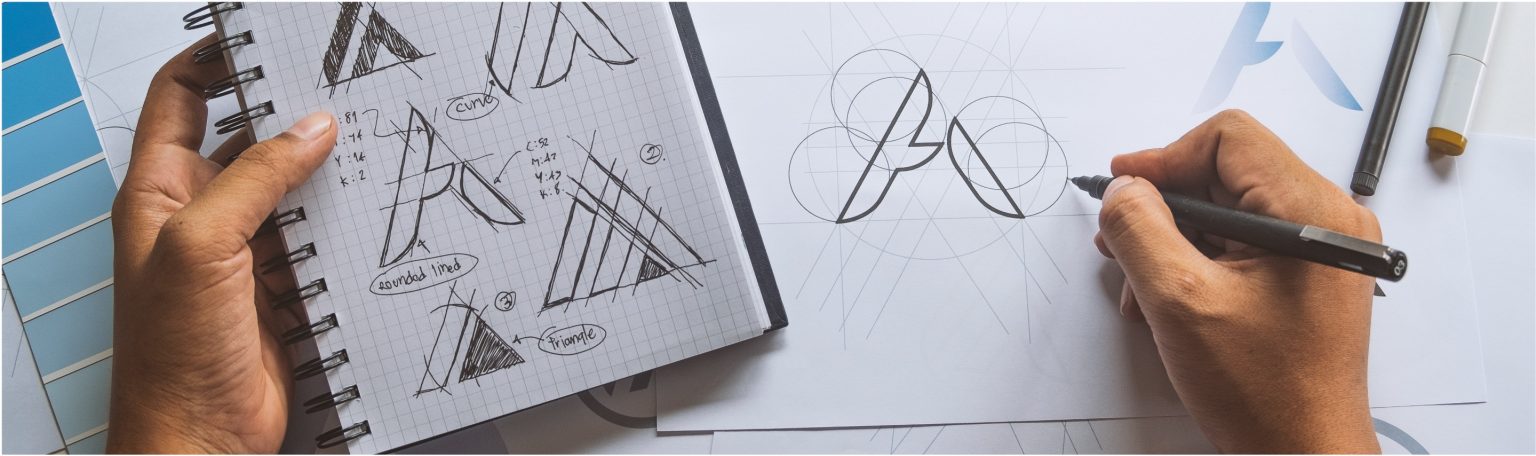
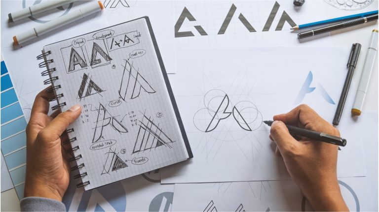
As part of my inspiration discovery, I would often write down keywords that are relevant to the company. Doing so helps to inspire visual symbols that represent the brand. I would then sketch as many ideas as possible. I’d explore different angles and permutations of these elements to create interesting or new perspectives of visual symbols. It often helps that I let the ideas flow freely at this stage; I shut my inner monkey voice and try not to restrict myself but rather, free associate and explore every possibility. At this stage, I go for quantity, not quality.
Step 4: Whittling and forming
Next, I’d let it rest. This is my cooling off period. I would then select a few sketches to develop further on the computer. This is when I strive for quality…throwing out the ones that don’t work, combining some interesting ideas to see what works, and the results can often be surprising. At this stage, details like colours and fonts are added. The logos are tweaked and refined until they achieve the desired result.
Throughout this stage, I will also consider logo applications. The context and media in which the logo might be placed is important and may result in the success or failure of the logo. For example, a logo that may be used on print will require a single-colour application, while a logo that lives mostly on the digital platform can be designed with the intent to animate.
Step 5: Getting feedback and evaluation
Now that a number of logos are created, I would take a step back and ask myself these questions
- Does this logo convey the brand and its personalities?
- Is the logo appealing and unique?
- Will it appeal to the target audience?
- Is it easy to apply this logo on the intended media?
- Does this logo meet and fit the brief?
It is also important to gather feedback from external parties. You might want to mix it up a little. If you know people who are the intended target audience, poll them for an opinion! I also find it useful bouncing my designs off colleagues; sometimes they might spot stuff I might have missed, or interpret certain symbols in ways that I never intended. From the feedback gathered, I would then further improve the logo. Sometimes this process takes hours, sometimes days. But it’s important to also know when to stop. There is such a thing as overdesigning.
Finally, when putting together my presentation of the logo, I try to deliver it “contextually” to help the client better envision the logo’s possible application. Placing logos on a poster, on a mug, on a truck, on a bag, whatever…pick the environments that suit the business. This often helps client see the logo “in action” and usually makes for better decision-making. It provokes the client to approach the logo from a more considered perspective: Does it spark the right chord or emotion? Can they see this logo living in their world, or more important, in their customer’s world?
Of course it’s worth mentioning that a logo cannot live on its own. A logo is just a small component of a much larger brand identity system. These can include not only supporting typefaces and colours but also brand imagery guidelines, copy tonality, or even experience design. Does it fit a sound or jingle? On print, what kind of texture should it appear in? All needs to work in harmony to support the brand’s positioning and objectives.
So the next time you wonder why a logo design takes so much time, well, now you know.