

Ansari Ali
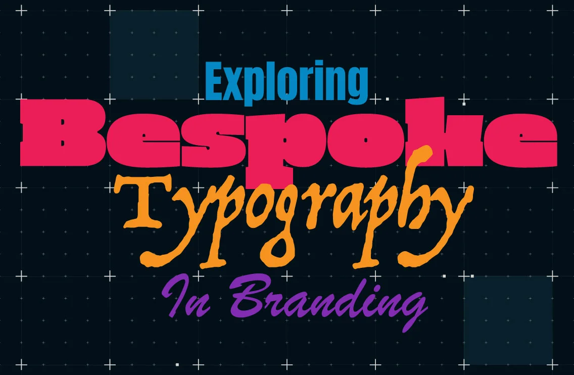
Bespoke typography is an effective branding tool that can help brands establish a unique visual identity. Custom typefaces are unique to the brand’s personality and values. They enhance brand communications and influence how the brand is perceived by the audience.
Let me break down the idea for you: Have you ever bought clothing that fits well but falls short in certain aspects? We often settle for a near-perfect fit, accepting certain shortcomings or making compromises. It’s also possible that we’re aware of the possibility that someone else could be wearing the same garment, yet we choose to take the risk and make the purchase regardless. A made-to-order garment is the only way to ensure a truly customised fit.
Similarly, this situation is also true for brands when it comes to bespoke typography: Ready-made typefaces versus custom-made ones. There is a growing trend among companies to commission custom typefaces for their brands.
In this article, let’s explore successful scenarios of brands that used bespoke typography.
Pros of bespoke typography
Greater control
A bespoke typography refers to a custom-made font that a particular brand creates to fulfil its branding needs. As a result, the designer has complete control over the typeface’s design attributes, such as its spacing and kerning.
Better legibility
By optimising a custom-made font for legibility and readability, the brand can effectively communicate its message.
Various touchpoints
Bespoke typography can unify branding across various touchpoints like digital media, ads and packaging for consistent visual identity.
Consequently, this consistency helps to reinforce and create a cohesive visual language.
Distinct personality
Bespoke typography are a long-term investment in branding, as they are unique to the brand and cannot be replicated by competitors. In fact, bespoke typography can help brands to stand out from the competition and build a strong brand identity.
Case studies
Netflix’s bespoke typography
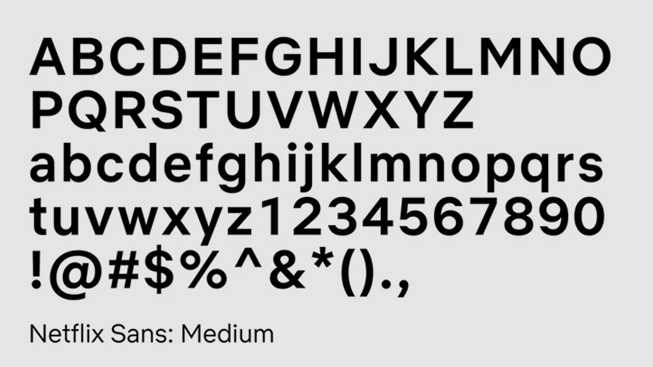
In 2018, Netflix’s in-house design team collaborated with Dalton Maag Foundry to develop a custom-made font called Netflix Sans for the streaming platform’s brand identity.
In an effort to mitigate the rising costs of font licensing, Noah Nathan, the design lead at Netflix, took the initiative to create a custom-made font that would serve as a unique visual element for the brand’s identity. With the objective of producing a typeface that would not only look pleasing to the eye but also function well in various applications, the design team undertook a rigorous design process that accounted for both aesthetic and practical considerations.
HP integrated collection of global scripts for improved brand identity
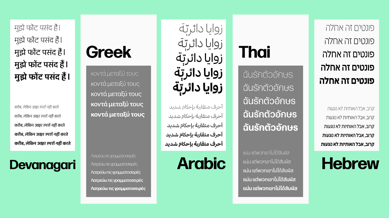
HP (Hewlett-Packard) created global scripts to better serve their customers in diverse regions and cultures around the world. In particular, a global script is a typeface that includes characters and symbols from different languages and writing systems. This allows HP to communicate with their customers in a way that is both clear and culturally respectful.
HP and Wieden+Kennedy asked Type Network to add 5 new scripts to Forma DJR, a sans-serif typeface with a clean, modern look, and available in a range of weights and styles. In particular, the 5 new scripts are Arabic, Devanagari, Greek, Hebrew and Thai. These scripts will allow HP to communicate with customers in a variety of languages and cultures, which is important for a global company. Each design team from different countries independently created their allocated script using Forma DJR as a base. Consequently, the result is an integrated collection of global scripts to better serve their international customers, by improving accessibility and usability on a global scale.
Apple’s bespoke typography optimised for maximum clarity and legibility
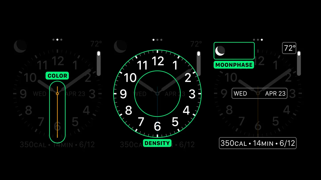
In 2000, Apple changed the typographical identity for iOS and OS X by replacing Helvetica Neue with a custom-made typeface called San Francisco.
In addition, San Francisco is the 1st in-house typeface that Apple has designed in over 20 years. The developers optimised the software for the Apple watch platform at first, limiting its use to watches only. However, they later expanded its functionality to include desktops and phones. The developers realised its potential for accessibility across multiple devices. So, they invested additional time and resources to extend its compatibility.
With this system font update, Apple is no longer using off-the-shelf fonts for its user interfaces. In the past, they have used Lucida Grande (2000–2014) and Helvetica Neue system wide. The latter font was too light, too thin for small lower-res mobile screens. In response to the need for enhanced clarity and legibility, the designers made modifications to San Francisco and, consequently, greatly optimised the font.
Personalised typefaces
World Press Photo: WPP’s headline typography
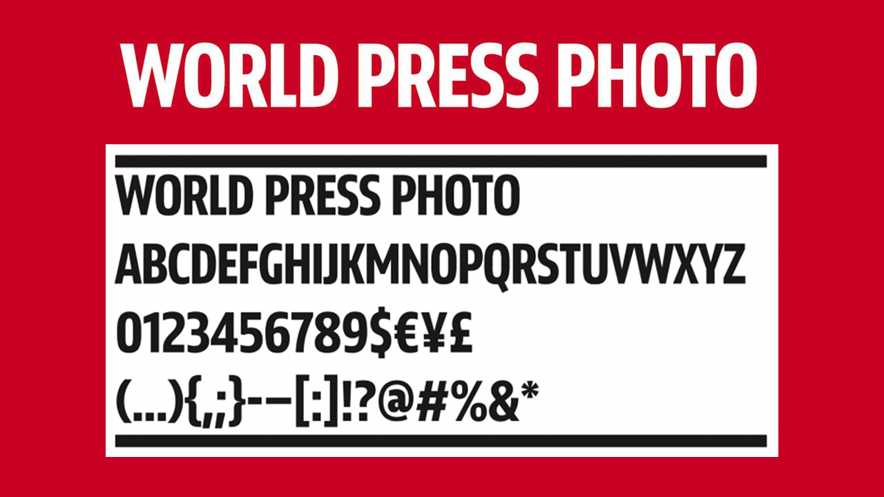
World Press Photo commissioned a custom-made font just to be used for its generic logo. Through the use of a personalised typeface, the company can trademark its identity with ease and avoid any licensing problems that may arise from the use of the original Futura logo.
The Mandai Wildlife group: Mandai Value Serif typography
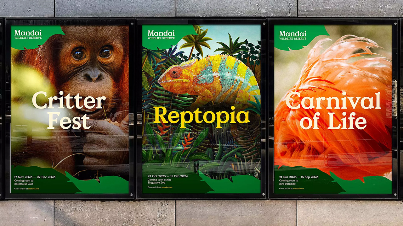
As part of their refreshed identity, the Mandai Wildlife group developed a new bespoke typeface. Consequently, this created a cohesive visual identity as they manage most of Singapore’s zoos, incl. the Singapore Zoo, Night Safari, Bird Paradise and River Wonders.
Vogue Singapore’s bespoke typography
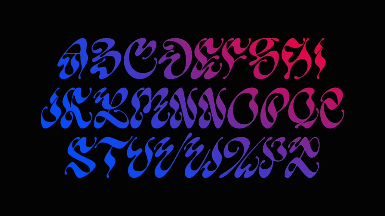
With the overarching concept of “Strange is Beautiful”, Vogue Singapore collaborated with Studio Nari to create a bespoke typeface that challenged the conventional rules of typography. In order to do this, Studio Nari wanted to create a typeface that challenged people’s perception of editorial design. They achieved this by incorporating unexpected elements into the typeface, such as asymmetrical curves and irregular spacing. The 3 key creative elements that went into the typeface are
- Vanda Miss Joaquim orchid, the national flower of Singapore
- Singapore Stone, which is an important relic from Singapore’s earliest history
- A juxtaposition of thin and thick lines to create a sen1se of strangeness and point of interest
Are you now considering how to incorporate a bespoke typography into your brand strategy? A typeface that has your specifications, design and customised for a unique and memorable visual identity? In addition, customised typefaces set your brand apart and create an exceptional visual experience that others cannot imitate.